
PortfolioCenter 5.8 brought us the ability to create custom Presentation Studio reports. Need some of ideas on how to use this great new feature?
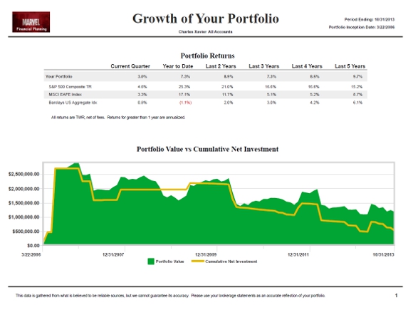
One of my managers loves the “mountain chart” (a.k.a. “Portfolio Value versus Cumulative Net Investment”). However many of his clients find the version on the Presentation Studio Overview reports too small to read and he doesn’t like the graph on a page by itself.
Solution: The above report displays a bigger mountain chart in Presentation Studio style and pairs it with returns that focus on the long term.
To create it use the following:
Base Page: Two Pane Stacked Layout
Layout: Landscape
Top Element: Performance vs Benchmarks Table
Bottom Element: PortfolioValue vs Cumulative Net Investment
Theme: Clean
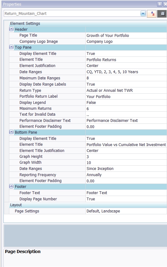
Notes: The key is changing the Graph Width to 10. See settings below.